An owner of a drag racing team commissioned me to design a team t-shirt as a gift to her family. The client likes the vintage drag racing t-shirt design, and she has drawn a sketch for me to bring to life.
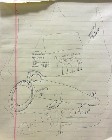
I would usually brainstorm and do 3-5 concepts, but since the client has a specific image in her mind. My priorities are to execute the idea, optimize the layout, and decide on a color scheme.
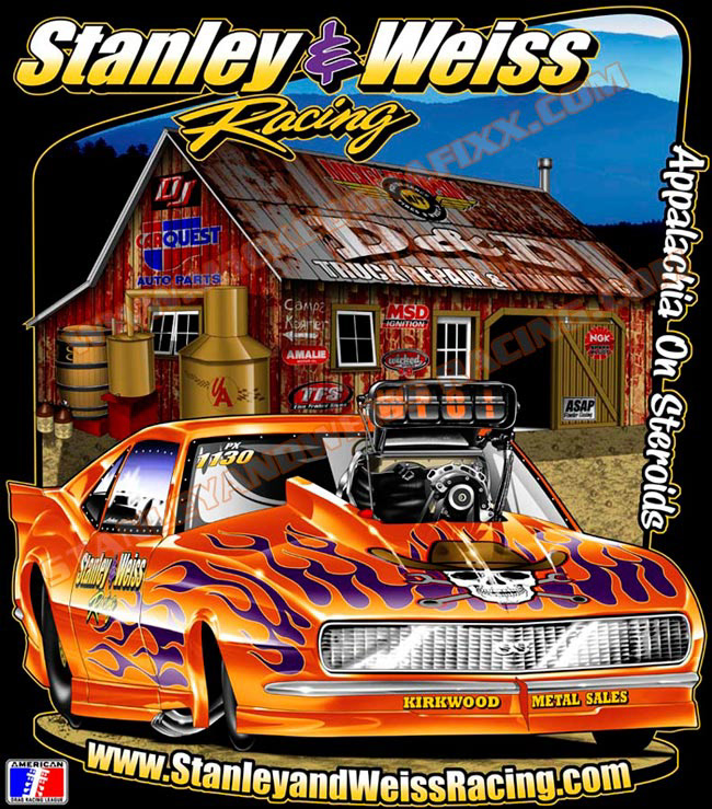
Also, the image on the right was provided by the client, but I have to remind her that the example image is digital and not for screen printing. Screen printing uses spot color and usually has a limit of 6.
Also, the image on the right was provided by the client, but I have to remind her that the example image is digital and not for screen printing. Screen printing uses spot color and usually has a limit of 6.
My mood board on Pinterest.
The client has also provided me with many reference photos to base on, which was helpful.
The client has also provided me with many reference photos to base on, which was helpful.
This is the initial line work done in Procreate. As you can see, the composition follows closely to the client's sketch, but because of the Twisted T logo, I feel the whole look is quite odd.
Thus I've suggested this alternative layout to the client and added some burnout smokes to the car to push the excitement further. The client loved it.
After this stage, the rest is quite easy.
After this stage, the rest is quite easy.
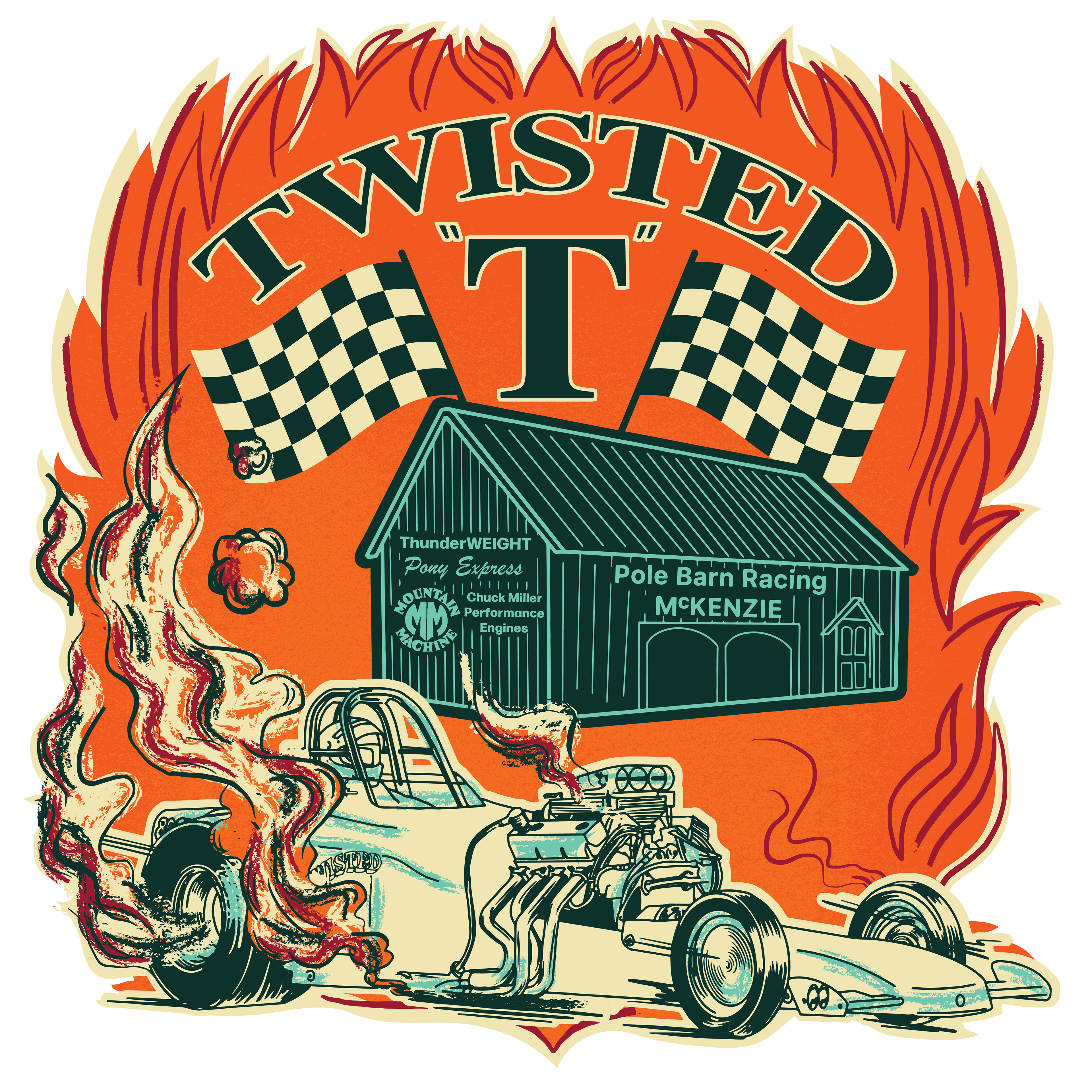
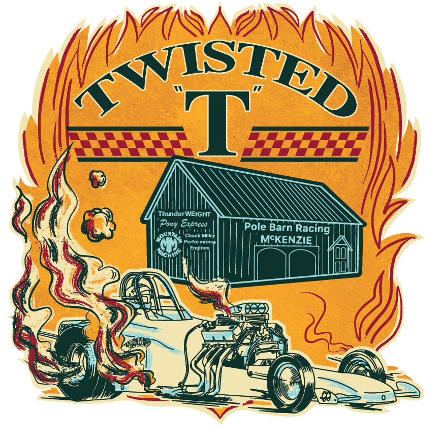
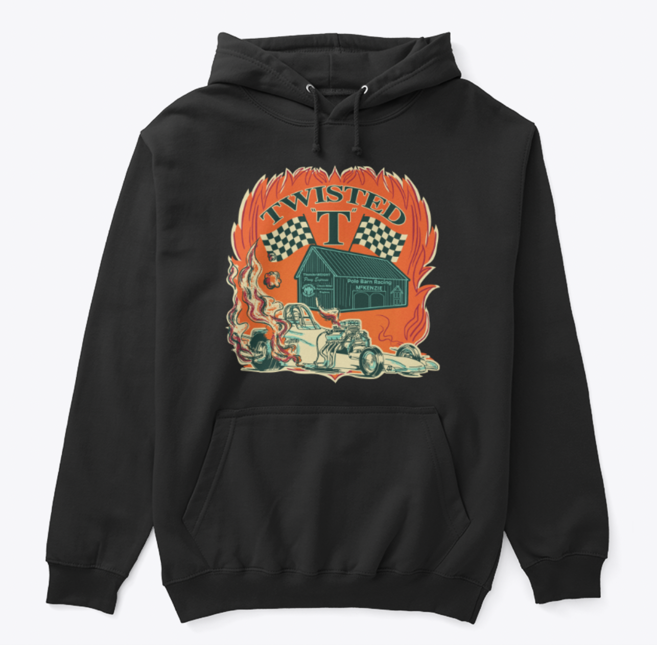
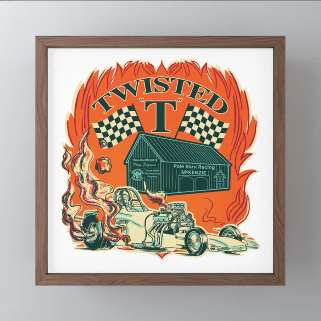
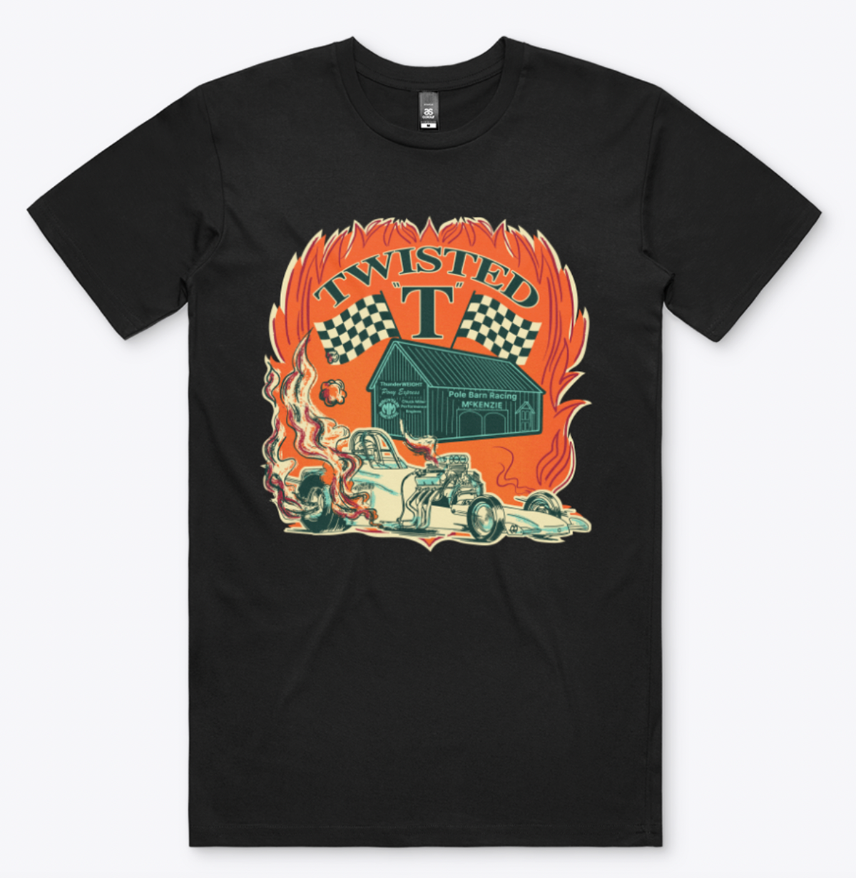
And voila! Here are the final two and the mockups.
Which one do you like more?
Feel free to contact me for your projects!
Which one do you like more?
Feel free to contact me for your projects!
